-


WEB前端
站-
热门城市 全国站>
-
其他省市
-
-

 400-636-0069
 小职
2020-10-13
来源 :https://developer.51cto.com/art/202010/628351.htm
阅读 942
评论 0
小职
2020-10-13
来源 :https://developer.51cto.com/art/202010/628351.htm
阅读 942
评论 0
摘要:在前端的学习中,使用flex如果采用space-between两端对齐,会遇到最后一行难以对齐的问题。本文主要对多行多列这种常见的布局,列出解决方案,方便大家日常开发使用。
前言:因为项目中使用flex过程中,如果采用space-between两端对齐,会遇到最后一行难以对齐的问题。本文主要对多行多列这种常见的布局,列出解决方案,方便大家日常开发使用。
话不多说,直接进入正题:
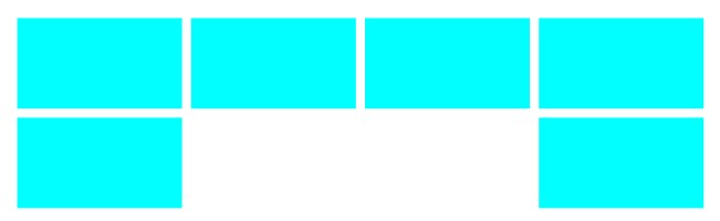
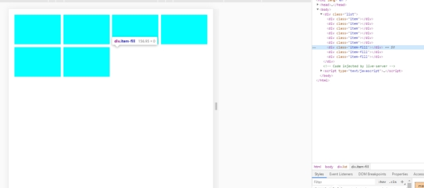
方案一:标签补位
我们都知道,之所以对不齐是因为最后一行的子项目没有达到4个,space-between的对齐方式,自然会把中间空出来。既然如此,何不直接补位,让元素排满4个。
<!-- 样式 -->
<style>
.list{
display: flex;
justify-content: space-between;
flex-wrap: wrap;
}
.item{
/* flex: 0 0 24% 该属性等价于 flex:none;width:24% */
flex: 0 0 24%;
height: 100px;
background-color: aqua;
margin-bottom: 10px;
}
.item-fill{
flex: 0 0 24%;
height:0;
}
/* 消除最后一行多余边距 */
.list .item:nth-last-child(-n+4){
margin-bottom: 0;
}
</style>
<!-- html -->
<div>
<div></div>
<div></div>
<div></div>
<div></div>
<div></div>
<div></div>
<div></div>
<div></div>
<div></div>
</div>
效果如下:
如果子元素个数不是4个怎么办?我们细心观察,不难发现,最后一行的最小值是1个,那么我们只需要补位n-1个即可。如果只有3个,也可以用伪元素::after去补最后一个位置。
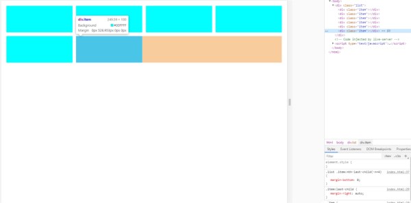
方案二:计算剩余空间
如果我们知道最后一行剩余空间的话,完全可以控制最后一个元素的边距或者缩放比例去占满剩下的空间,自然就能左对齐了。要做到这一点,首先得确定宽度和边距,宽度通常是已知的,我们只需要把边距确定下来,就能确认剩余空间。
接上面的的例子,假设一行有4个, 每个占比24%,4个就是24% * 4 = 96% , 那么可以确定总边距是4%,由于一行有4个元素,而最后一个的右边距是多余的,那么可以确定单个的边距为 4% / 3 = 1.333% , 计算出来后就可以开始写代码了:
<!-- css -->
<style>
.list{
display: flex;
justify-content: space-between;
flex-wrap: wrap;
}
.item{
flex: 0 0 24%;
height: 100px;
background-color: aqua;
/* 边距懒得算,css函数代替 */
margin-right: calc(4% / 3);
margin-bottom: calc(4% / 3);
}
/* 去除每行尾的多余边距 */
.item:nth-child(4n){
margin-right: 0;
}
/* 使最后一个元素的边距填满剩余空间 */
.item:last-child{
margin-right: auto;
}
/* 也可以给列表增加一个占位元素,自动缩放填满剩余空间 */
/* .list::after{
content: '';
flex: 1;
height: 0;
} */
.list .item:nth-last-child(-n+4){
margin-bottom: 0;
}
</style>
<!-- html -->
<div>
<div></div>
<div></div>
<div></div>
<div></div>
<div></div>
<div></div>
</div>
效果如下:
可能有些小伙伴觉得懒得记,那么下面直接给出封装好的sass mixin, 复制即可使用:
/**
* 多列布局
* $count 项目数量
* $itemWidth 项目宽度,百分比,不含百分号
* $itemHeight 项目高度,随意
*/
@mixin grid($count:4, $itemWidth:20, $itemHeight:auto) {
$rest: 100 - $itemWidth * $count; // 剩余空间
$space: percentage($rest/($count - 1)/100); // 边距
display: flex;
flex-wrap: wrap;
/*此处的*号建议替换成具体的布局容器(div,view...),以加快css解析*/
& > * {
flex: 0 0 #{$itemWidth + '%'};
height: $itemHeight;
margin-right: $space;
margin-bottom: $space;
box-sizing: border-box;
&:nth-child(#{$count}n) {
margin-right: 0;
}
&:nth-last-child(-n + #{$count}) {
margin-bottom: 0;
}
/*为了兼容space-between的布局,占满剩余空间*/
&:last-child {
margin-right: auto;
}
}
}
/*使用方法*/
.list{
/* 一行4项,每项20%宽度 */
@include grid(4,20)
}
以上为flex版本,假如你需要兼容ie浏览器,那么可以用float布局替换,float自动左对齐,也就不需要填充最后的剩余空间了。
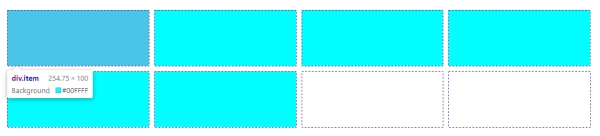
方案三:网格布局
网格布局,默认就是左对齐,即使使用space-between。
<style>
.list {
display: grid;
justify-content: space-between;
grid-template-columns: 1fr 1fr 1fr 1fr; /*设置等比列*/
gap: 10px; /*行间距*/
}
.item{
background-color: aqua;
height: 100px;
}
</style>
<!-- html -->
<div>
<div></div>
<div></div>
<div></div>
<div></div>
<div></div>
<div></div>
</div>
效果如下:
上面的三个方案各有各的好处:
方案一的缺点是实现不够优雅,需要增加无用的占位标签。
方案二倒没什么缺点,除了写法会复杂点,但只要封装好mixin在sass中使用足够简单,即使需要兼容ie,也只需要换成float即可。
方案三,兼容性最差,无法在ie中正常使用,但用法最简单,布局甚至比flex还要强大。
综上,实际使用中,还是推荐使用方案二。
关注“职坐标在线”公众号,免费获取最新技术干货教程资源哦!
 喜欢 | 0
 不喜欢 | 0


您输入的评论内容中包含违禁敏感词
我知道了

请输入正确的手机号码
请输入正确的验证码
您今天的短信下发次数太多了,明天再试试吧!
我们会在第一时间安排职业规划师联系您!
您也可以联系我们的职业规划师咨询:

版权所有 职坐标-一站式IT培训就业服务领导者 沪ICP备13042190号-4
上海海同信息科技有限公司 Copyright ©2015 www.zhizuobiao.com,All Rights Reserved.
 沪公网安备 31011502005948号


 索取资料
索取资料

 答疑解惑
答疑解惑

 技术交流
技术交流

 职业测评
职业测评

 面试技巧
面试技巧

 高薪秘笈
高薪秘笈